Last week has been a particularly busy one for all things Microsoft concerned. Future Decoded 2016 came and went, with a whole range of interesting announcements and presentations from those within the industry. And, of course, we saw the release of Dynamics 365 for Enterprise on Tuesday, an event which I discussed more closely as part of last week’s blog post. There’s a lot about Dynamics 365 which is going to take some time to fully understand, and also a lot of features which are not yet fully available. I have been hearing rumours that there will be a December update, targeted at existing CRM Online users who wish to make the jump across, that will unwrap a couple of features that are currently disabled within Dynamics 365. Chief among these looks to be the App Builder and also what looks like some kind of sitemap editor tool! :O In the meantime, there a lot of changes that need digesting, and I wanted to focus this week on a particular group of new features/changes relating to Processes. For the uninitiated, processes is a broad term to describe a group of different Dynamics 365 for Enterprise (D365E) components that can be created within the system- namely, Workflows, Dialogs, Actions, Business Process Flows and Business Rules. Whilst not all of these have received attention as part of the new release, the ones that have definitely look to be in a much more enhanced and polished position compared to Dynamics CRM 2016 Update 1. Let’s take a look at some of these changes in more detail:
Process Designer
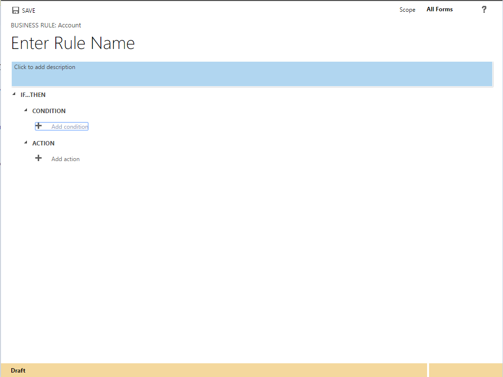
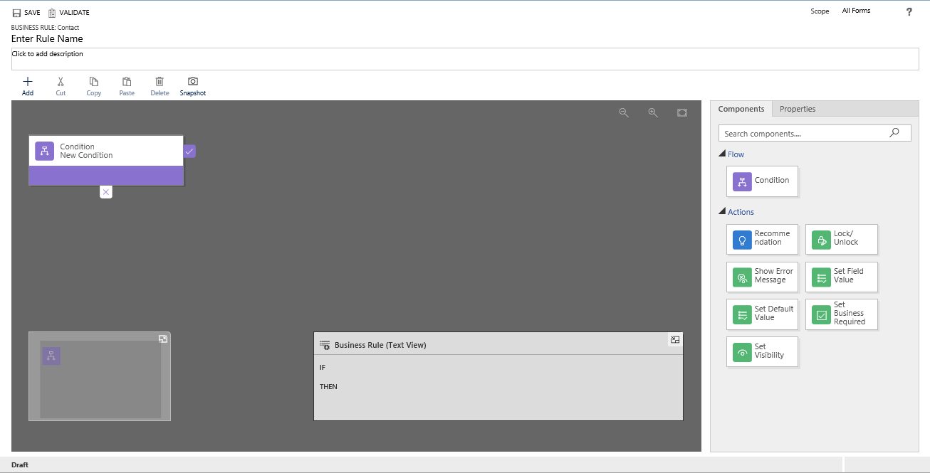
The introduction of the Process Designer for Business Rules, Business Process Flows and Task Flows is perhaps the most noticeable and welcome enhancement to processes. Now, instead of linearly attempting to visualise how your processes operate, you can very quickly grasp how they look via the visual designer. What’s more, you have the ability to drag and drop your components quickly and easily, re-ordering them accordingly and seeing clearly how each step flows into the other:
What’s also welcoming about this is that, for those who prefer a more “old school” approach to seeing how a Business Rule is structured, the Text View window provides a means of accommodating this. A nice and welcome touch!
Business Rule Recommendations
I really like this next new feature 🙂 When it comes to data inputting, one of the major challenges you face is ensuring that the data is entered correctly. These problems can be compounded in situations where data needs to conform to specific rules - for example, if Field A and Field B equal ‘ABC’, then set Field C to ‘DEF’; otherwise, set to ‘GHI’. The common solution to this problem in the past is to look at programmatic means of ensuring data is entered correctly - generally via a Business Rule or a form-level JScript function. Whilst these generally are effective at addressing the problem, they could be prone to errors and can be seen as being too absolute a solution, that doesn’t address what could be an underlying problem within a business; namely, a lack of understanding of business processes and how things should be done.
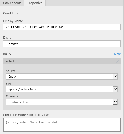
The new Recommendation Action as part of Business Rules would appear to seek towards addressing this gap, by providing an unobtrusive way of alerting users that there is a problem with the data they have entered onto a form and giving them an opportunity to correct their mistake. In the process of doing this, you can provide contextual information that explains why the data needs to be changed - increasing transparency and understanding from end users of the application. Setting them up is very straight-forward - just setup your Condition and then you can drag and drop the new Recommendation component onto the designer screen. To see how this works in practice, let’s look at an example on the Contact form - we want to ensure that if the Spouse/Partner Name field contains a value, that the user is prompted to update the Marital Status field accordingly. First, we build our condition as we would normally in a Business Rule:
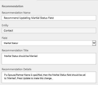
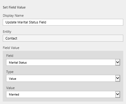
Next, we hook up our Recommendation component and configure it accordingly - setting the Recommendation properties and then our Set Field Value action
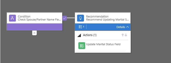
Your Business Rule should look like the below when ready:
When activated and then, upon navigation to the Contact form, we can see it in action; when the Spouse/Partner Name field is changed, a blue exclamation mark appears next to the Marital Status field. Once clicked, we get some guidance information and the ability to update the field:
Et voila! The introduction of this new feature is a welcome surprise on my part. One limitation currently is that only one type of Action is supported with a Recommendation - Set Field Value. Here’s hoping that this is expanded as part of a future version of D365E to include additional Actions.
Validation for Business Rules
Previously, when building a Business Rule, the only way you could effectively determine that there were logic problems in your Business Rules is by activating them and testing them yourself on the form level. This is a potentially torturous process that could very well result in errors seeping through unintentionally. Now, as part of the new visual designer, the logic can be validated at any point and is also validated upon save. If unsuccessful, you are alerted to this fact and given some guidance on what is wrong so you can look at fixing the issue:
Hopefully, having this built in now will help avoid some of the most obvious mistakes that can sometimes seep through when building a Business Rule.
Snapshot
Often, when you are attempting to document a system, you will want to include some kind of pictorial representation of the system - a process map, diagram or something similar. Now, with the updates made to Business Rules and Business Process Flows, you have the ability to obtain screenshot of the designer window - all through the click of the Snapshot button:
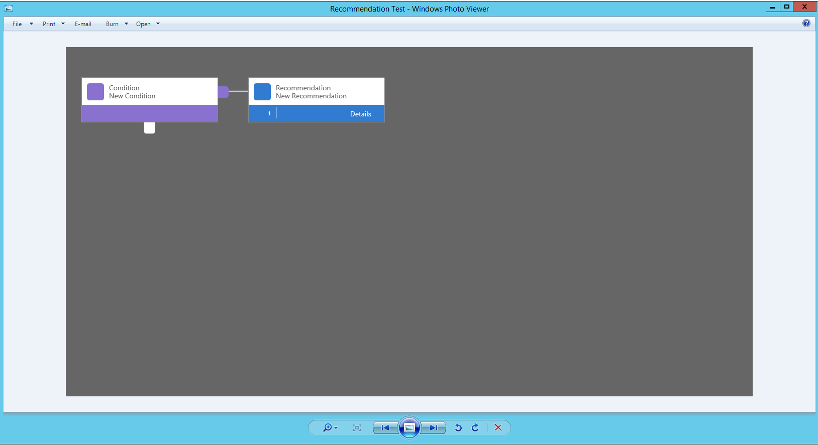
Pressing this will download a .png image of the Process, that you can very easily include as part of existing documentation relating to your system:
This is a very handy new feature that will no doubt save a lot of time in the future! One thing to remember is that, if you wish to include all Components underneath the Details section, then you will need to expand it first before pressing the Snapshot button.
Task Flows
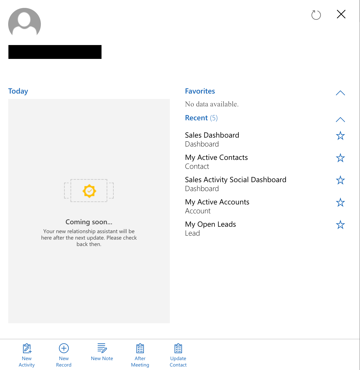
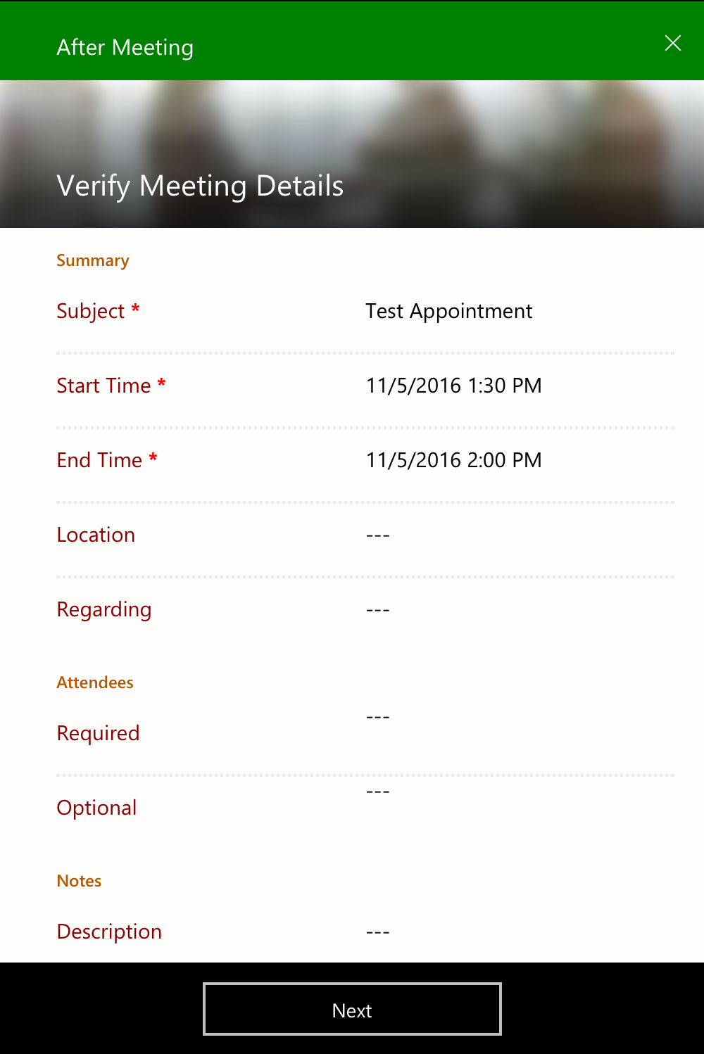
Having come out of Preview from Dynamics CRM 2016 Update 1, Tasks Flows are still very much in their infancy and something which I am still trying to get my head around fully. My understanding is that they are essentially a combination of Workflows and Dialogs, but designed solely for the Dynamics CRM/365 for Tablets Mobile Application. From the mobile app, they are accessible from the new Summary area that appears when the app first launches (and where the heavily touted Relationship Assistant will reside once released). Taking the example After Meeting Task Flow, we can see how this looks in the mobile app. First, we launch the app and navigate to Summary area:
From there, we can see along the bottom of the tab all available Task Flows that can be launched based on the clipboard task list icon:
Clicking this then launches a New Appointment record screen and then the first Page of the Task Flow which, once completed, will then execute the custom logic in the background:
Task Flows look very versatile and powerful, but I think will require some closer testing and experience before I’m able to comment further… 😖
All in all, Processes seem to have received a lot of love and attention as part of the initial Dynamics 365 for Enterprise release. Microsoft has set the bar at the right level in creating the process designer, and the hope is that this is eventually rolled out for Workflows and other processes as well. Workflows, in particular, can benefit greatly from having a more visually accessible appearance, especially given the complexity that these can have when used to their fullest potential.

