
Happy New Year! As 2019 dawns upon us, Microsoft Business Application professionals start in the right place, as the concept of the Power Platform starts to take hold. Through this, it is pleasing to observe more consistency across these range of products, with regular releases, increased integration and better learning tools, provided directly from Microsoft. I’ve mentioned this previously on the blog, but it is worth emphasising again the increased importance Power BI has from a Dynamics CRM/365 Customer Engagement standpoint. With this in mind, having a New Years resolution to learn more about it and to earn a technical qualification in the subject will hold you in good stead in future. If you are reading this now, then hopefully you already have this resolution. 🙂
Today’s post will continue my series focused on providing a revision tool for Microsoft Exam 70-778. This week, we move into the broad subject area Create and format interactive visualizations, which revolves around the following skill areas:
Select a visualization type; configure page layout and formatting; configure interactions between visual; configure duplicate pages; handle categories that have no data; configure default summarization and data category of columns; position, align, and sort visuals; enable and integrate R visuals; format measures; Use bookmarks and themes for reports
Let’s start by providing an overview of just what a visualization is, before deep-diving into the specific topic areas listed above. The examples provided in this post refer to the latest Power BI Desktop sample report 2018SU12 Blog Demo - December.pbix, which can be downloaded from GitHub using this link.
Visualization Overview
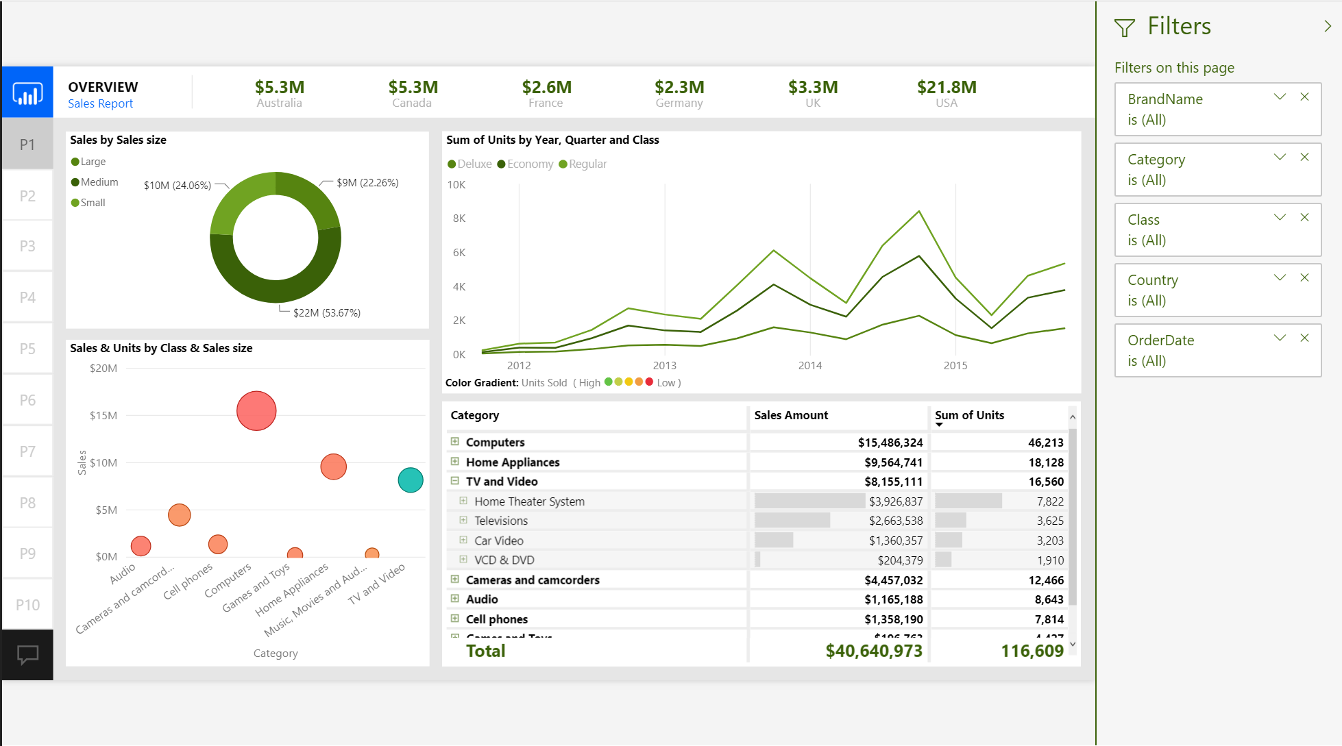
The majority of topics covered in this series have all concerned the foundations of a successful Power BI report - the data sources, the data quality enhancement work and the required DAX wizardry to create custom columns, Measures or table objects to supplement any requisite Power Query manipulation. With the necessary foundations, walls and various utilities built for your Power BI “house”, the final and most important topic concerns the decoration - creating impactful and meaningful visualizations that help to display your data most appropriately. The great thing about using Power BI as your Business Intelligence tool is the vast array of default and custom visualizations that are available when developing a report. The Visualizations pane on the Report tab lists all of the possible visuals available for your report, described further in the list that follows (in order, left to right, top to bottom):
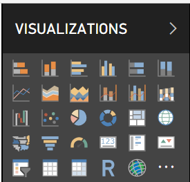
- Stacked bar chart
- Stacked column chart
- Clustered bar chart
- Clustered column chart
- 100% stacked bar chart
- 100% stacked column chart
- Line chart
- Area chart
- Stacked area chart
- Line and stacked column chart
- Ribbon chart
- Waterfall chart
- Scatter chart
- Pie chart
- Donut chart
- Treemap
- Map
- Filled map
- Funnel
- Gauge
- Card
- Multi-row card
- KPI
- Slicer
- Table
- Matrix
- R script visual
- ArcGIS Maps for Power BI
Power BI also supports custom visuals, provided by ISV’s or Node.js developers, that allow you to include additional visualizations in your report. You can work with these by clicking on the ellipsis icon on the Visualizations pane:
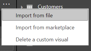
There are two web links relating to custom visuals that are worth considering further:
- The Business Apps marketplace, accessible also via the Import from marketplace button, lets you either add new custom visuals directly into Power BI or download versions that you can then import using the Import from file button. There are a lot of great visuals available here, that can help to supplement your existing reports and take some of the aggravation out when implementing more complex requirements (e.g. displaying Gannt chart visuals).
- The Developing a Power BI custom visual Microsoft Docs Tutorial walks you through the required steps to build out a custom visual using Node.js.
Just dragging and dropping a visual onto a report and adding a few field values may not be enough to meet a specific business requirement. For this reason, you should consider the following when working with visualizations:
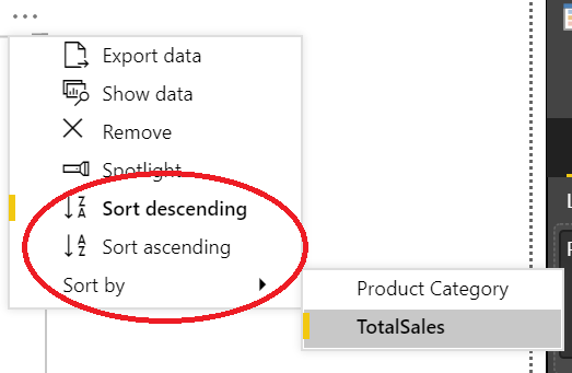
- Does the visual require sorting in ascending, descending or by a particular column order? If so, then clicking on the ellipses button at the top right of the visualization will expose several sortation options, which may differ based on the underlying dataset:
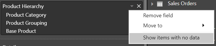
- Are there blank categories within your data? If so, you may encounter a similar issue as indicated in the screenshot below, with a (Blank) category value:

- Resolutions to this problem can vary - for example, you could go back into your query and add a default value for all blank columns values - but a quick way to potentially fix this is to click on the down arrow next to the field and select the Show items with no data option:
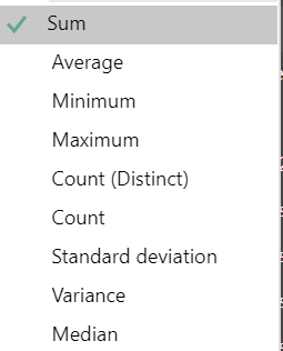
- Does the default summarization need to be overridden for the Values field? We’ve seen previously in this series how it is possible to specify the default summarization for each column in your dataset. On occasions where this needs changing, you can again use the right arrow next to the field to carry this out:
Finally, you also have some additional options available by selecting the Format tab with a visual selected:
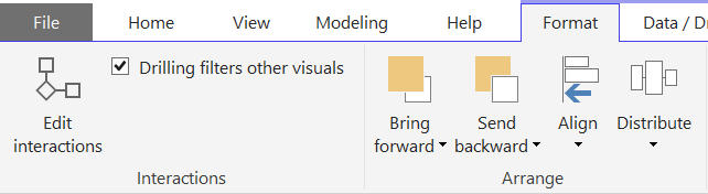
The options above the Arrange heading should be self-explanatory, but it is worth focusing on the Edit interactions button. An expected experience with Power BI is, as you begin to filter visualizations, others on the report update accordingly by applying the same filter. This behaviour can be changed using the Edit interactions button, allowing you to specify whether other visuals on the report:
- Apply a cross-filter
- Apply a cross-highlight
- Do nothing
The default action for most visualizations is to apply a cross-filter. The sequence below demonstrates how this can be disabled using the Edit interactions button:
A handy feature to have at your disposal, further details regarding the Edit interactions button can be found on the Change how visuals interact in a Power BI report Microsoft Docs article.
Deciding Which Visualization To Use
Both for a real-life and exam scenario, you should be prepared to identify when a visualization will be appropriate to use, based on a stated list of requirements. As a general rule of thumb, if:
- You need to compare data between different categories, then use a Bar/Column or Ribbon Chart.
- The requirement is to compare data values across a date range, then use a Line or Area Chart.
- You are working with a dataset that contains multiple fields with wide value ranges, then use a Combo Chart.
- There is a need to show significant variances across a set of data or to highlight significant amounts in comparison to others, then use a Waterfall Chart.
- You are working with two metrics that have a relationship between them and you need to visualise diverse value types, then use a Scatter Chart.
- Data needs to be grouped by a distinct category and shown as part of a whole value, then use a Pie or Doughnut Chart.
- The requirement it to distinctively show proportions of an overall part and, by association, the most significant/smallest contributors, then use a Treemap visualization.
- Your data is geographically based, and there is a desire to provide drill-down capability, then use a Map, Filled Map or ArcGIS Maps for Power BI visualization.
- You are working with data based on distinct stages (e.g. Lead data from Dynamics CRM/365 Customer Engagement, grouped by Business Process stage), then use a Funnel visualization.
- The data needs to be consumed via a single value or viewed as represented in the underlying data, then use a Card, Multi-Row, Table or Matrix visualization.
- There is a need to provide users with the capability to filter data “on the fly”, then use a Slicer visualization.
- An R script requires incorporation into your report, use an R visualization (discussed in further detail later on in this post).
- You need to report data concerning Key Performance Indicator (KPI) monitoring, then a KPI or Gauge visualization should be chosen. These are both discussed in greater detail in my previous post on this subject.
Report Page Options
Visualizations form an essential part of the look and feel of a report, but further options are also available from a report design perspective. With a report page selected and with the Format paintbrush icon chosen (which is accessible in the same way as described in section Visualization Format Settings in my post concerning KPIs), you have access to additional options relating to the currently selected page:
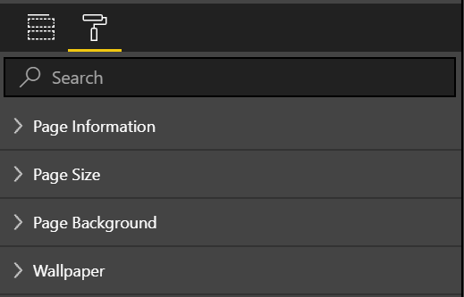
The options available here include:
- Page Information: Here, you can change the name of the page, as well as enable/disable the Tooltip and Q&A features for this page.
- Page Size: The options here let you adjust the size of the page to one of several options:
- 16:9 (1280 x 720)
- 4:3 (960 x 720)
- Cortana (296 x 592)
- Letter (816 x 1056)
- Custom
- Page Background: From here, you can change the background colour of the page and adjust its transparency. It is also possible to add a background image here too.
- Page Wallpaper: Potentially confusing when compared against the Page Background options, the options in this section let you adjust the colour outside of the main page area. The best way of understanding how this looks is to take a look at the following garish example, which shows a page that has had both background and wallpaper colours specified:
Never develop a report that looks like this, by the way. 🙂
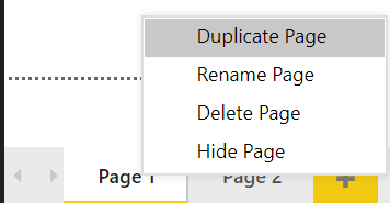
When it comes to working with multiple pages, you also have the following options available, accessible through right-clicking a page:
Formatting Measures
Measures, as with other column types (derived either from a query or a DAX formula), can be formatted in numerous different ways. The steps involved here do not differ significantly from the options discussed in the Formatting Columns section of my previous post concerning data model optimisation; select the Measure in question from the Fields pane, navigate to the Modeling tab and the appropriate options will be made available to you.
R Visuals
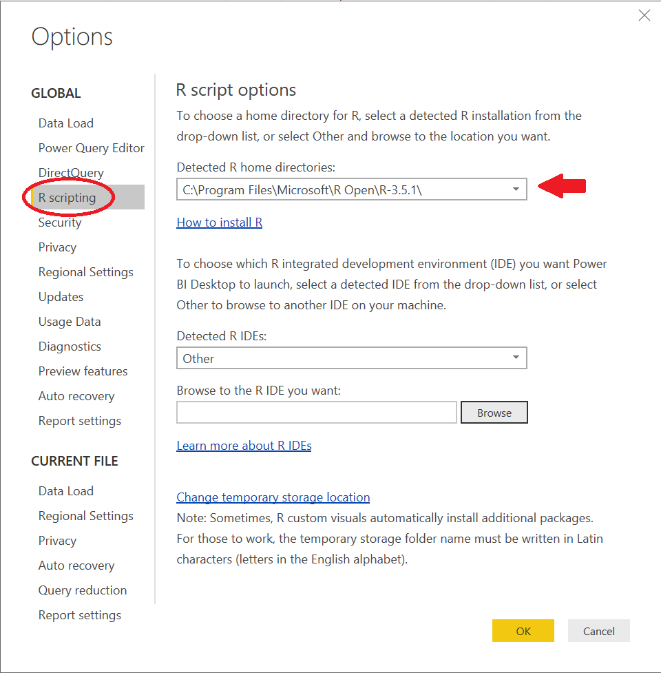
R provides developers with the means of building highly sophisticated and bespoke visualizations, that will typically be consumed for statistical analysis. These can be added to Power BI Desktop and linked to any data source in your report. There are two necessary components required to start working with R visuals in this manner:
- You must install R on your local machine. There are many versions available, with R Open 3.5.1 from Microsoft being the logical choice for beginners.
- Within the Options area of Power BI Desktop, you must verify that the correct Detected R home directories dropdown is selected. If you have installed R Open 3.5.1 on your machine, then this should be filled for you automatically, as follows:
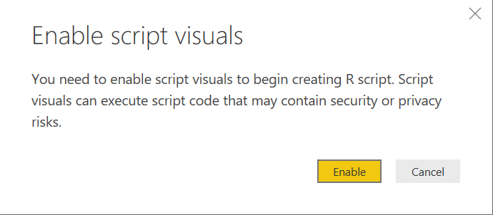
(You may also be prompted to Enable script visuals, as indicated by the dialog box below; ensure that the Enable option is selected)
Beyond the basics of getting started with R in Power BI, which is all that is required from an exam perspective, this is a topic too complex to cover in this blog post.
Bookmarks
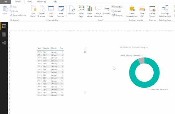
The ability to pre-configure a report page, from a filtering standpoint, can be incredibly useful for those who consume a Power BI report. Bookmarks seek to address this need, by allowing developers to build a guided “story” in their report. All that is required is for a report page to be filtered accordingly and then for a Bookmark to be added - couldn’t be simpler! For example, the 2018SU12 Blog Demo - December.pbix sample report contains several Bookmarks, accessed by opening the Bookmarks Pane on the View tab:
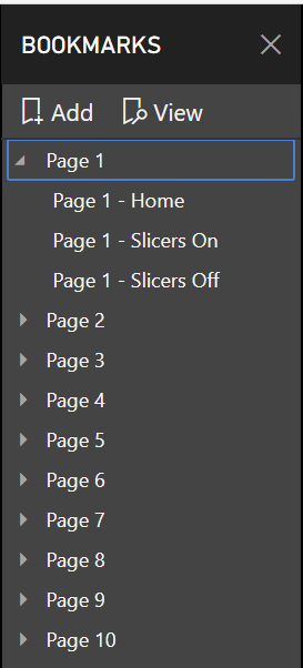
With the Selection pane also enabled, you can then easily navigate between all Bookmarks by clicking the View button above and using the arrow icons on the bottom of the page:

Through the Bookmarks pane, it is also possible to re-order Bookmarks and to group them by a category, such as a page. Simple to setup, but powerful when utilised, they are a feature which I think gets overlooked and should be considered if you are building out a report for beginner Power BI users.
Themes
A feature that has typically been available with every Microsoft Business Intelligence (BI) application is extensive design capabilities, atypically to suit any bespoke branding requirements that an organisation may have. Power BI is no different in this regard, because, as well as being able to specify the colour of visualizations individually, developers also can define a top-level Theme that will automatically apply to all report visualizations. The Switch Themes button provides users with the ability to modify their Report theme at any time, located on the Home tab:

As shown in the image above, you can:
- Change the Theme from Default to one of the other include Theme definitions within Power BI, such as Electric or High Contrast.
- Add a custom Theme to your report using the Import theme button.
- Browse the Power BI Community Theme gallery to download a custom Theme developed by someone else.
- Get additional help on theming through the How to create a theme button, which links to the Use Report Themes in Power BI Desktop support article.
The ability to import and develop bespoke Themes is a topic that requires further discussion. All Themes are defined as JSON files, which outline the different hex colour values that Power BI allocates for each visualization type. There is a hell of a lot of options available here, depending on how masochistic you are feeling stringent your branding requirements need to be. For the exam and most real-life scenarios, a straightforward JSON file (provided courtesy of Microsoft) may resemble the below:
{
    "name": "St Patricks Day",
    "dataColors": ["#568410", "#3A6108", "#70A322", "#915203", "#D79A12", "#bb7711", "#114400", "#aacc66"],
    "background":"#FFFFFF",
    "foreground": "#3A6108",
    "tableAccent": "#568410"
}
Once saved as a file with the name St Patricks Day.json and imported into the sample 2018SU12 Blog Demo - December.pbix report, we get this rather…distinctive look:
The options available with Themes are always worth keeping in the back of your mind and, chances are, they can provide the means towards ensuring consistently branded Power BI reports.
Key Takeaways
- Power BI delivers, out of the box, a range of different visualizations that cater towards most (if not all) reporting requirements. Should you find yourself in need of additional visualizations, then Microsoft AppSource is your go-to destination for finding visualizations developed by others. If you have experience working with either Node.js or R, then these can be used to build bespoke visualizations also.
- When first developing a report, you should be able to match a requirement for a specific visualization type, to ensure that you are delivering a solution that is both meaningful and useful. From an exam perspective, this becomes a more critical consideration, and you should be prepared to suggest the most optimal visualization to use when given a specific scenario.
- After adding visualization’s to your report, you have additional options available to customise them further. For example, you can specify a preferred sorting order for your data, override any summarizations used and move/align your visual on the report page.
- By default, visualizations in Power BI are designed to change automatically, based on how users interact with the report. All of these options are controllable via the Edit interactions button, allowing you to specify your preferred cross-filtering and cross-highlighting conditions.
- There is a range of report page customisation options available to developers. It is possible to resize a page to any possible height/width, allowing you to optimise your report for specific devices. Also, you can modify the colour of a page (or its wallpaper) or add an image instead. Pages can also be renamed, reordered or duplicated.
- Measures can be formatted in the same way as calculated columns, meaning you can specify a data type or, for numerics, modify the number of decimal places.
- Bookmarks allow developers to set up “checkpoints” within a report, based on how a report page has been filtered. These can then be used to automatically navigate the user through a report, applying these filtering steps automatically. This feature can help transform your report into an interactive story.
- Visualizations will automatically inherit their various colour properties from the currently selected report theme. Although these can be modified granularly, the fastest and most consistent way of making these changes en masse is to change the Theme. Power BI includes some Themes out of the box, but you also have the option of building your own using a custom JSON file; this can then be imported into different reports, providing a portable means of enforcing a particular branding requirement.
Visualizations are a HUGE topic for the exam, with a lot of detail that requires careful consideration. I hope this post has provided the right balance between highlighting the most critical areas, without going into minute detail. I would, therefore, urge you to go away and carry out studying yourself to gain a greater appreciation of this subject area. Next weeks post will be somewhat lighter reading, as we take a look at how application developers can integrate Power BI within their existing apps.