The New Year is almost upon us, meaning its time to put in place some resolutions for the year ahead. I can think of no better commitment then to learn more about Power BI in 2019, which is hopefully the reason why you are reading this right now 🙂 . Welcome to the eighth post in my series concerning Microsoft Exam 70-778, where I hope to provide a learning/revision tool for anyone who is taking the exam or looking to increase their Power BI expertise. Last week, we investigated how to manage Key Performance Indicator (KPI) reporting using Power BI. We now move into another topic area that is also tied closely to visualizations - Create hierarchies. The related skills for this exam area are:
Create date hierarchies; create hierarchies based on business needs; add columns to tables to support desired hierarchy
In the sections that follow, I will provide an overview of the two different types of Hierarchies configurable within Power BI, before then providing a step-by-step guide on how to create one. As with previous posts in this series, this subject does bring together some other skill areas, such as importing data with Power Query and using DAX calculated columns. Knowledge of these topics will hold you in good stead when starting with hierarchies.
What is a Hierarchy?
Hierarchies form the cornerstone of a broad aspect of human existence, which makes it natural they are a common theme when it comes to Business Intelligence (BI) solutions. A hierarchy is definable as a logical, often visual, representation of an order of precedence. Hierarchies, in strict Power BI terms, do not differ much from this general definition; they allow developers to order data by preference, priority or anything in between. When configured and used in isolation, they offer minimal benefit to Power BI report consumers. They start to become really valuable when utilised alongside visualizations, providing an additional interaction point for key data points and allowing report users to tailor a visualization to suit their needs. Some potential usage scenarios for hierarchical data may include:
- Providing top-level and subcategory classifications for product records.
- Modelling a business reporting line hierarchy, from CEO down to Developer.
- Splitting sale date by quarter, year or even month.
Hierarchies come in two flavours within Power BI - Date Hierarchies and Custom (or User Defined) Hierarchies. The next two sections delve deeper into the inner workings of each.
Date Hierarchies
Date Hierarchies are best described as a logical breakdown of the constituent components of a date value, based on four different levels:
- Year
- Quarter
- Month
- Day
For each field that contains a Date Hierarchy, the appropriate value for each of the above is exposed out for utilisation across Power BI Desktop. So, for example, the underlying hierarchy values for the 3rd March 2017 would be:
- Year: 2017
- Quarter: Qtr 1
- Month: March
- Day: 3
All columns with a data type of Date or Date/Time will have a Date Hierarchy created for them automatically. The hierarchy will then become accessible for use in the following areas of Power BI Desktop:
- When building out formulas using DAX. For example, the screenshot below shows how it is possible to access the hierarchy field values listed above from the Date/Time field LastEditedWhen:
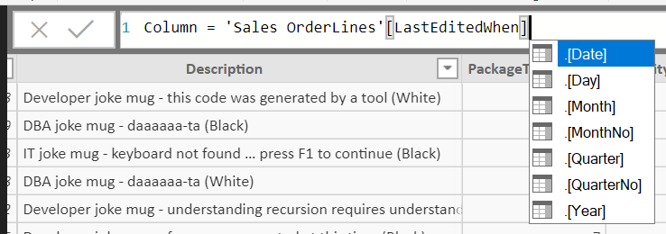
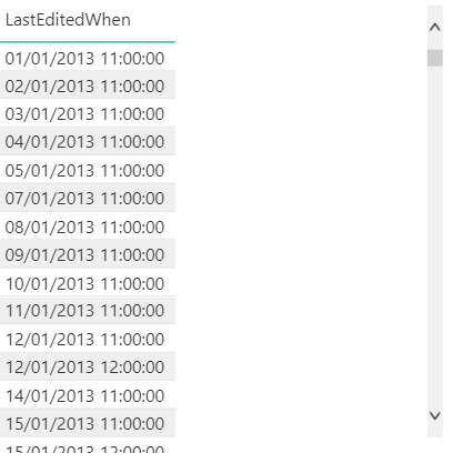
- When working with a Table visualization. Adding a Date or Date/Time column into the Values well will automatically create a table containing all of the hierarchy fields. An example of how this looks for the LastEditedWhen field is seen in the image below:

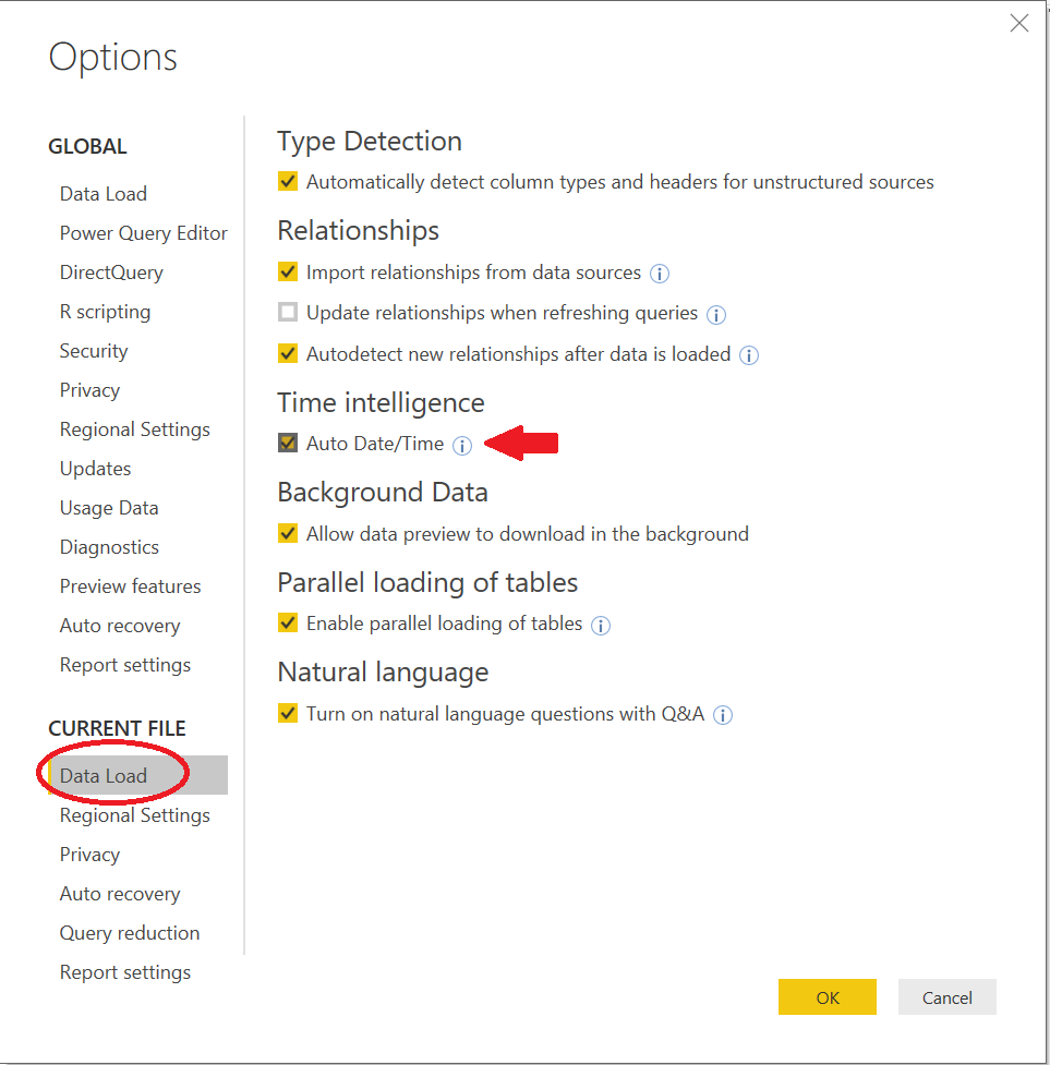
It is possible to disable the automatic creation of Date Hierarchies within the File -> Options area of Power BI Desktop, by toggling the Auto Date/Time option. Take care when toggling this though, as doing so will remove any existing Date Hierarchies within your model:
This fact is confirmed when returning to the Table created using the LastEditedWhen field, which automatically reverts to the base column value when the Auto Date/Time option is disabled:
Custom Hierarchies
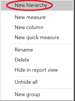
For more bespoke requirements, a Custom Hierarchy affords the same kind of functionality discussed in the previous section. They can be created from the right-hand Fields pane by selecting a field within a Power BI table and choosing the New hierarchy option:
Once established, you can then:
- Rename the hierarchy. By default, it will be named using the convention Hierarchy.
- Include additional fields by dragging and dropping them into the hierarchy.
- Reorder the hierarchy, by dragging and dropping the fields into your preferred order, from top to bottom.
- Delete the hierarchy through right-clicking it and selecting the Delete option. All fields included in the Hierarchy will remain as part of the underlying query.
A Custom Hierarchy typically relies on a self-relationship that a query might have on itself. An excellent example of this, already alluded to, is an Employee table, where an individuals Manager is trackable via a ManagerID column, that resolves back to an EmployeeID record. In these cases, there are several DAX functions available that will assist in getting custom columns set up to support your hierarchy, described collectively as Parent and Child Functions. Usage of these functions is essential when building out Hierarchies involving parent/child relationships.
The exercise at the end of this post will go through the detailed steps involved in creating a Custom Hierarchy.
Using Hierarchies with Visualizations
A good reason to include hierarchies as part of your Power Bi Reports is the options they unlock from a data drill-down perspective. We’ve seen already the behaviour Date Hierarchies adopt when using the Table visualization, which offers nothing in this respect. Other visualization types support, by comparison, far richer options for “homing in” on a particular piece of data, epitomised by the following buttons that appear at the top of the supported visualization:
In order, from left to right, these let you:
- Drill up your data one level in the hierarchy.
- Enable the Click to turn on Drill Down feature, allowing you to click on any part of a visual to drill-down to the next level of the hierarchy.
- Go to the next level in the hierarchy.
- Expand all down one level in the hierarchy. This behaves differently to the Click to turn on Drill Down option mentioned already, by grouping together the previous hierarchy level each time you drill-down.
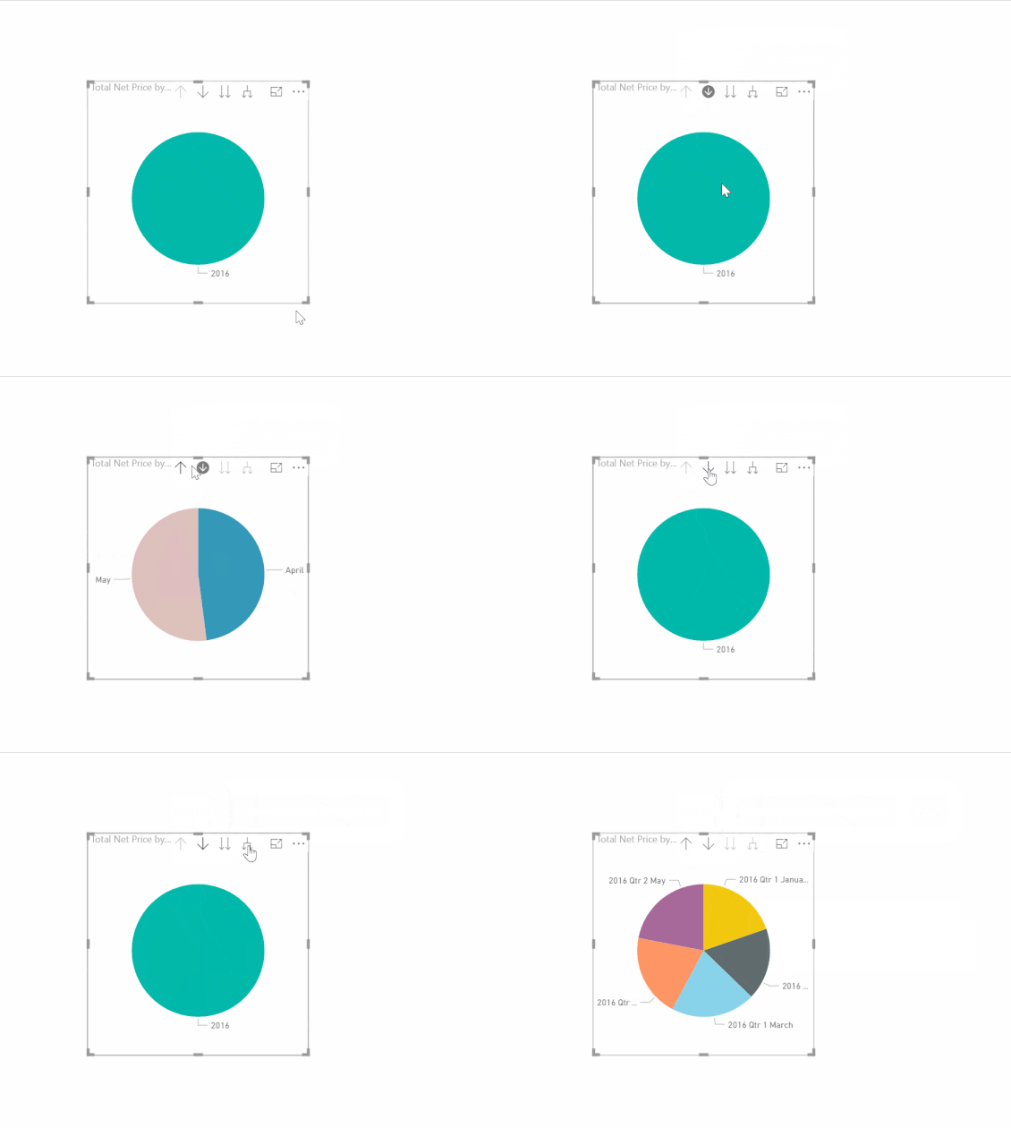
An example of how all this works as part of a Pie chart visualization is viewable in the sequence below:
As should hopefully be clear, hierarchies are very much the icing on the cake in building an engaging and wholly interactive reporting solution within Power BI.
Example: Creating a Hierarchy and adding it to a Visualization
The steps that follow provide instructions on how to build out a product categorisation hierarchy, using sample data, and then how to apply this to a Donut chart visualization. All that is required to work through these steps is access to the Power BI Desktop application:
- In Power BI Desktop, click on Edit Queries to open the Power Query Editor. Navigate to the New Source button and select the Blank Query option:

- Select the newly created Query1 in the Queries pane and click the Advanced Editor button. Copy and paste the following M code into the window and press Done:
let
    Source = Table.FromRows(Json.Document(Binary.Decompress(Binary.FromText("nZNNbsMgEIWvgrxqJRb438mybZZRonrpZoGScYNiYwvsqu11epOerBjstHKwE3WBhJj3vjdoIMsc18HO4/MabXjBOCzRijcgasEkoDtJy7qA+5sUgVrfXwEOCXF2OHO8kWsrqhykZBWnxRR5SmPYHo6jRLP9kS9tKD9QcZji2uqGGeE4cTUz6D0piDe2v7i85ThSS1tDtVm974+Uv0Kf+Vc3Uzojus0mz7sEPwptafPVgROPlC1rJinj2sBIfnVPIE9NVVsIlsrgX1yq8kqgNTtI9gnopSXEiyZe0X99iZ5mgheumaZL7LC0pEWBHlqpBiGlenBQsra80sF1k4kPfM+Ed38qPVIB24rxxjL32WKkYS4h2Pf623SfKT191KD7OXdiAd8iMgEhDn2F3/0A", BinaryEncoding.Base64), Compression.Deflate)), let _t = ((type text) meta [Serialized.Text = true]) in type table [ProductID = _t, Name = _t, #"Product ID" = _t, Parent = _t, TotalSales = _t]),
    #"Changed Type" = Table.TransformColumnTypes(Source,{{"ProductID", Int64.Type}, {"Name", type text}, {"Product ID", type text}, {"Parent", Int64.Type}, {"TotalSales", Currency.Type}}),
    #"Replaced Value" = Table.ReplaceValue(#"Changed Type",null,0,Replacer.ReplaceValue,{"TotalSales"})
in
    #"Replaced Value"
This will then load up a table object that resembles the below, which derives from the sample Product data from Dynamics CRM/365 Customer Engagement:
Right-click the Query1 query and use the Rename option to change its name to Products. Select the Close & Apply button to exit the Power Query Editor.
- Open the Data pane, select the Products query and use the following DAX formulas to create New Columns for the table:
-
ProductHierarchy = PATH(Products[ProductID], Products[Parent])
-
Product Category = LOOKUPVALUE(Products[Name], Products[ProductID], PATHITEM(Products[ProductHierarchy], 1, INTEGER) )
-
Product Grouping = LOOKUPVALUE(Products[Name], Products[ProductID], PATHITEM(Products[ProductHierarchy], 2, INTEGER) )
-
Base Product = LOOKUPVALUE(Products[Name], Products[ProductID], PATHITEM(Products[ProductHierarchy], 3, INTEGER) )
-
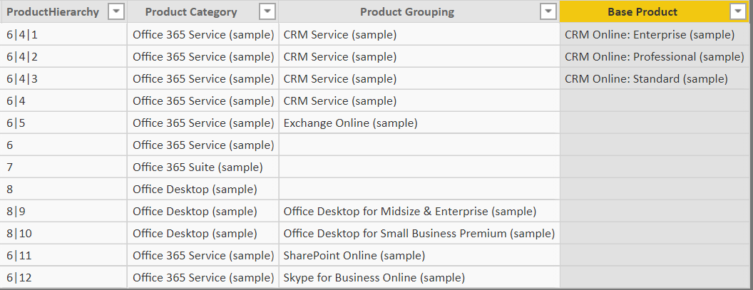
The first field creates the required hierarchy list in a delimited format; the remaining columns then list out the three levels of the hierarchy as separate column values. The data in your table should resemble the below if done correctly:
- Right-click the Product Category field in the Fields pane and select New Hierarchy, to create a new hierarchy as indicated below:

- Modify the newly created hierarchy so that:
- It is named Product Hierarchy
- It contains, in addition to the Product Category field, the Product Grouping and Base Product fields.
- The order of the newly added fields reflect the following:
- Product Category
- Product Grouping
- Base Product If done correctly, the Hierarchy should resemble the following:
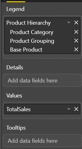
- Click on the Report tab and add an empty Donut chart visualization to the report. Populate the Field well values as shown below:
The Donut chart should update accordingly, and with the appropriate drill-down options available at the top of the visualization. Notice also that hovering over each section of the Donut chart displays an aggregated total for that level of the hierarchy:
Key Takeaways
- Hierarchies within Power BI provide a means of logically categorising data into an order of preference or precedence, providing greater flexibility to Power BI report users when they interact with visualizations.
- Date Hierarchies are created and managed automatically by Power BI for each Date or Date/Time field defined within your model. These automatically create fields that contain the Year, Quarter, Month & Day values from the respective date fields. These fields can then be utilised as part of a Table visualization or within a DAX formula. Date Hierarchies can also be completely disabled if required.
- Custom (or User-Defined) Hierarchies need to be created manually and provide additional customisation options when compared to Date Hierarchies, such as the number of fields they contain, the order and its name. A Custom Hierarchy will typically make use of one of several Parent/Child DAX functions, such as PATH or PATHITEM.
- Including a hierarchy as part of a chart visualization, such as a Pie chart or Donut chart, opens up other drill-down capabilities around your data. Indicated by the additional arrow icons included at the top of the visualization, they provide the means for users to interrogate data points that interest them the most straightforwardly.
The past couple of posts have already started to introduce some of the visualization options available within Power BI. In next week’s post, we will take a much closer look at all of the options available within the application to display data, as well as look at features such as Bookmarks and the various report page customisation tasks available to developers when building out a report.

