As we move into the festive period, now is the time to put your feet up, relax, take stock for the year ahead…or, if you are reading this over Christmas, grab the opportunity to learn more about Power BI 🙂 . In the seventh post in my series concerning Microsoft Exam 70-778, we move away from the suitably large subject area of DAX into a topic much more visually focused and accessible - Measure performance by using KPIs, gauges and cards. The related skills for this exam area are:
Calculate the actual; calculate the target; calculate actual to target; configure values for gauges; use the format settings to manually set values
As part of this week’s post, I hope to delve deeper into each of these skill areas, with the aim of providing a revision tool for the exam or a general learning aid for those getting to grips with Power BI for the first time. To follow on as part of any examples that follow, make sure you have downloaded the WideWorldImporters sample database and hooked up Power BI Desktop to the tables described in my first post in this series.
KPI Overview
A standard reporting requirement, and one which typically forms the basis of any contractual performance monitoring is the studying of Key Performance Indicator (KPI) figures. These are designed to provide an executive level view to answer questions such as “How is our sales pipeline progressing?” or “Have we met our objectives to reduce the number of monthly complaints down to X number?”. The whole process of collating together diffuse data sources to present this information may, in the past, have been exhausting. With Power BI, it is possible to deploy a dedicated KPI visualization that allows you to straightforwardly and consistently report headline figures, track variance over time and receive immediate visual cues to flag up any potential issues.
To get going with your first KPI visualization, you must supply two critical pieces of data:
- Indicator: This is the “actual” value that needs reporting against a target, and will typically be some form of aggregation contained within a Measure.
- Trend axis: Representing the performance of your indicator based on a range of data, the most typical axis type to use here would be some form of date value - such as month or year.
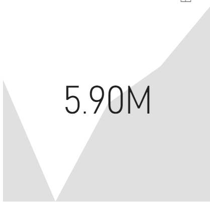
A KPI configured with just these two properties will work but looks…well…bland and not very useful at all:
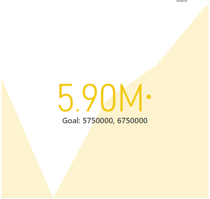
This is why a Target Goal should additionally be specified. Adding this will allow for the appropriate colour to be applied to the visualization, to indicate how well the Indicator is performing against your target. The great thing about this is that up to 2 Target Goal values can be specified if needed. You potentially lose some functionality here, as the Distance percentage value will no longer display correctly; but this may be useful if, for example, you have an aspirational target that there would be a benefit in hitting, but is not a strict requirement. When the value of one Target Goal is determined to be fulfilled, but the other isn’t, the Visualization will display Amber by default, as indicated below:
The example at the end of this post will walk through the steps involved in setting up a KPI.
Gauge Visualizations
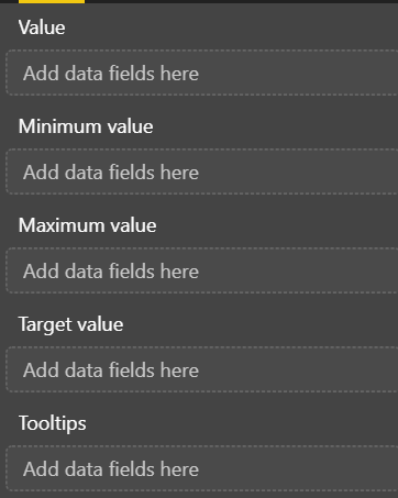
We got a sneak peek into Gauge’s when working with What-If Parameters in last week’s post, but a more in-depth discussion regarding them is necessary. Gauges provide a different means of viewing how a subset of data is performing against a target. They differ from KPI’s primarily due to the additional configuration options they afford and the potential they have to provide a faster means of interacting with key data points on the visualization. The configurable field well properties for a Gauge is viewable below, in the screenshot and descriptive bullet point provided:
- Value: This is the value that requires tracking, similar to the Indicator within KPI’s.
- Minimum value: The minimum amount that needs to be hit by the Value before the Gauge will be filled in.
- Maximum value: The maximum amount that needs to be hit by the Value before the Gauge stops filling (i.e. a Gauge with a Value of 105 and a Maximum value of 100 would display as full).
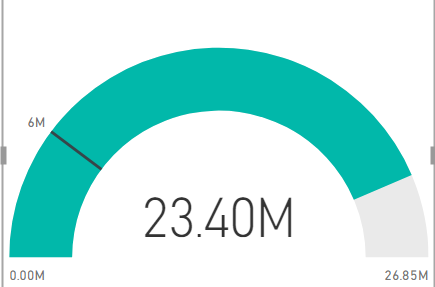
- Target value: The target that needs hitting, which will be presented as a black line on the Gauge, as shown below:

- Tooltips: These are additional field values that will be displayed to the user when hovering over the Gauge. These fields can either be aggregated variants of columns or a Measure.
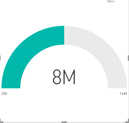
Gauges behave differently from KPI’s in that they will “work” with only one field well specified. For example, adding a Measure with a value of 8 million as the Value will display a half-full Gauge, as indicated below:
Notice that, in this scenario, the Gauge assumes the maximum amount to be double of what is specified in the Value field well - in this case, 16 million. A Gauge configured so frugally has little purpose and you should, as a minimum, ensure that the Maximum value and Target value field wells are also set, as demonstrated below:
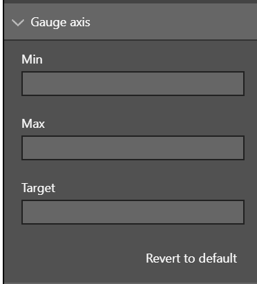
A nice little feature of Gauges is the ability to specify any of the potential field well values manually, within the Formatting options (discussed in the next section). The Value field well must be populated already within your Gauge to support this feature. You will then have the ability to manually specify the other values within the Gauge axis options area:
Any manually defined figure will be automatically overwritten and deleted if you choose to use a field from a table instead, so take care here to avoid any data loss.
Gauges address a similar need to KPI’s, in that they allow you to view possible progress against a maximum or target value. A significant downside in using them is that they present a less visual means of showcasing potential issues with your data. You should weigh these advantages/disadvantages up when determining whether to use a Gauge or a KPI as part of your report.
Visualization Format Settings
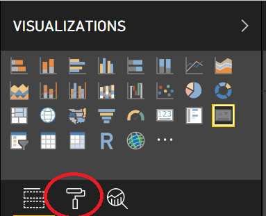
All Visualization’s within Power BI can be customised, often to the extent where they can look indistinguishable from when you first add them onto your report. The Formatting tab on the right-hand pane is your go-to destination in this regard, and is accessible by clicking the paintbrush icon while selecting any Visualization:
The types of things that are achievable via these options include, but are not limited to:
- Modifying all aspects of the visualizations Title, such as its visibility, the text displayed, font colour/size/type and alignment.
- Adding a colour background to the visualization.
- Including a description for the visualization.
- Toggling a border for the visualization and its colour.
- Fine-tuning the exact location of the visualization on the report, based on its X & Y Position values.
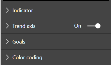
Each Visualization will also have a set of specific, unique options. We can see an example of how this looks by going back to KPI’s again and examining the top four options listed:
- Indicator: This area provides options on how to display the Indicator field value on the KPI. It is possible to round up figures to the thousands, millions and even trillions, and also to adjust the number of decimal places shown. Auto is the default option used and will generally assign the best rounding option, depending on the underlying value.
- Trend Axis: Here, it is possible to enable/disable the trend visual on the KPI. The example below demonstrates how this looks when disabled:
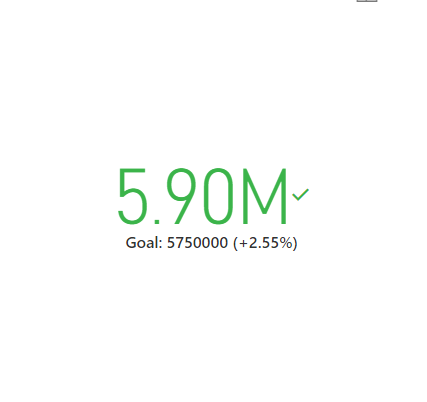
- Goals: With the Goal toggle, it is possible to remove the Goal figure underneath the Indicator value completely; the Distance toggle will remove the percentage distance value as well. It is possible to mix and match options here, as indicated in the example below:

- Color coding: The default RAG (Red, Amber, Green) traffic light system should be suitable for most situations but, if you have a specific branding requirement, it is possible to override the Good, Neutral and Bad colours with a custom Hex colour value. The Direction option also lets you reverse how the KPI works. So, for example, if raising more than 5 IT service requests would lead to a Bad outcome, any number underneath this would appear as Good instead.
When it comes to this subject area for the exam, there is no need to study the whole range of formatting options available; however, a general awareness will hold you in good stead.
Example: Creating a KPI
The process involved in building out a KPI can be a lot more involved then you may suspect, based on the descriptions provided so far. Therefore, the example that follows is designed to show you the type of preparatory modelling steps that will be needed to put in place a working solution utilising KPIs. To follow through these steps, make sure you have connected Power BI up to the WideWorldImporters sample database and that the Sales.OrderLines table is within your Power BI data model:
-
In Power BI Desktop, on the Sales OrderLines table, use the New Column button to add on the following new calculated columns:
- GrossPrice = ‘Sales OrderLines’[UnitPrice] * ‘Sales OrderLines’[Quantity]
- NetPrice = ‘Sales OrderLines’[GrossPrice] + (‘Sales OrderLines’[GrossPrice] * (‘Sales OrderLines’[TaxRate] / 100))
- OrderDate = RELATED(‘Sales Orders’[OrderDate])
-
Next, create a Calculated Table via the New Table option, that uses the following DAX formula:
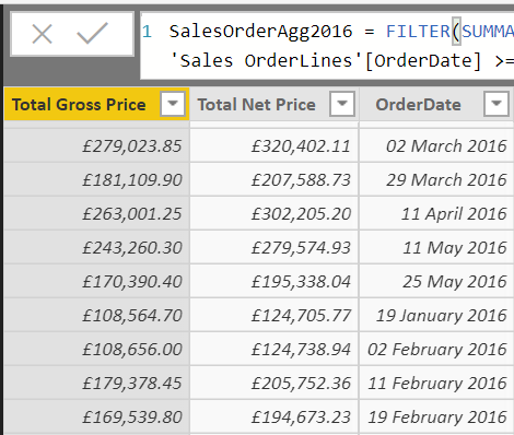
- SalesOrderAgg2016 = FILTER(SUMMARIZE(‘Sales OrderLines’,‘Sales OrderLines’[OrderDate], “Total Gross Price”, SUM(‘Sales OrderLines’[GrossPrice]), “Total Net Price”, SUM(‘Sales OrderLines’[NetPrice])), ‘Sales OrderLines’[OrderDate] >= DATE(2016, 1, 1) && ‘Sales OrderLines’[OrderDate] <= DATE(2016, 12, 31))
-
Doing this will create a new table object that looks similar to the below, providing a total sum of the calculated columns created in step 1), grouped by OrderDate. I would also recommend, at this stage, to change the format of the new columns to your preferred Currency value:
-
Add a new Calculated Column to the SalesOrderAgg2016 table to get the Month Name label from the OrderDate column:
- OrderDateMonthName = FORMAT(DATEVALUE(SalesOrderAgg2016[OrderDate]), “MMMM”)
-
With the base data ready, we can now look at creating an Actual and Target Measure on the SalesOrderAgg2016 table, using the following DAX formulas:
-
Actual Total Net Price = SUM(SalesOrderAgg[Total Net Price])
-
Target Total Net Price = 5750000
-
Actual Total Gross Price = SUM(SalesOrderAgg[Total Gross Price])
-
Target Total Gross Price = 5500000
-
-
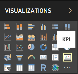
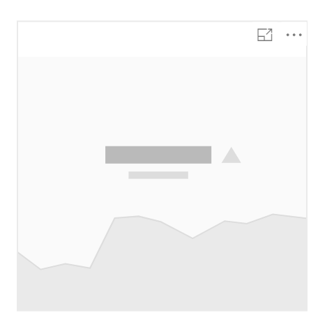
On the Report tab, under the Visualizations area, click on the KPI icon to add an empty KPI visualization to the report:
-
Click on the newly created Visualization and, under the Fields area, drag and drop the appropriate SalesOrderAgg2016 fields into the wells indicated below:
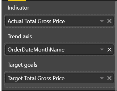
-
The visualization will then update accordingly, showing us the figure trend over each month and coloured red to indicate that this KPI is currently off target:
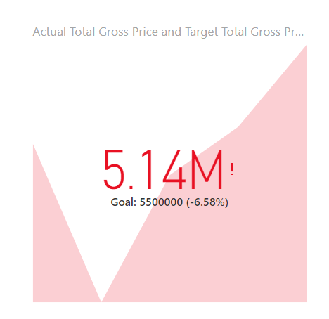
-
To see how a KPI looks when ahead of target, we can repeat steps 5) and 6), but this time using the Net figures instead:
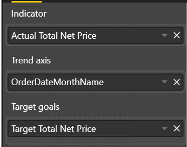

Key Takeaways
- There are two principle visualization types available within Power BI to help track actual-to-target progress - KPIs and Gauges.
- KPIs provide a more visually unique means of a binary success/fail determination when tracking towards a target. It is also possible to use KPI’s to track variance over time via the Trend axis. The Indicator will typically be the result of some form of aggregation or Measure.
- Gauges provide a less visually distinctive, but non-binary, mechanism of viewing progress towards a target. Gauges support more potential field well values when compared with KPIs, nearly all of which are optional in some way. You can also manually define some of these values, for situations where your data model does not contain the required information.
- All visualizations within Power BI are modifiable from a display or formatting perspective. The same basic options will generally be supported - such as changing a font type or background colour - with more specific configuration properties available per unique visualization type. For example, a KPI visualization can be customised to hide the background Trend Axis entirely. All of these options are designed to give developers greater control over the look and feel of their reports and to mirror them as closely as possible to any potential branding requirement.
- When building out a solution designed to monitor progress within Power BI, the steps involved will typically be more in-depth than merely creating a new visualization. In most cases, there will be a requirement to bring together a lot of the other skills that have been discussed previously within this series - such as creating DAX formulas, modifying data within Power Query or bringing together different data sources into a single model. It is essential, therefore, not to underestimate the amount of time and effort involved in creating a practical solution that takes advantage of KPIs or Gauges.
I hope that this weeks post has been a little easier to bear when compared with DAX. 🙂 In next weeks post, we will take a closer look at data hierarchies and how to apply these to visualizations within Power BI.

