If you’ve been working any length of time with Dynamics 365 Customer Engagement / Microsoft Dataverse Application Users, you will be well versed in the process of setting them up. As a process still bound to the “classic” experience, we would spend some time navigating to the Application Users view, selecting to create a new record and populating the form with crucial details such as the Application (Client) ID taken from the Application Registration in Azure. A few steps involved but hardly something that would make a massive dent in your daily work provided you knew where to go. 😉
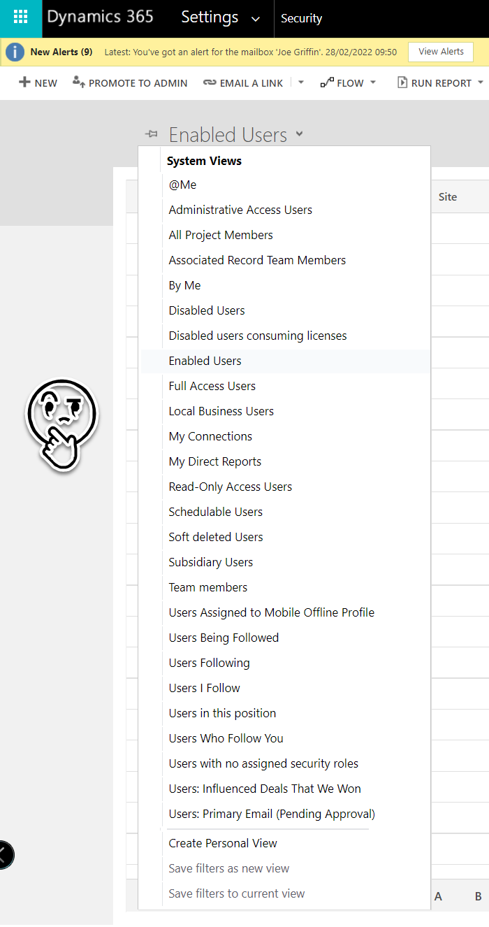
However, you may notice we suddenly no longer have access to this view when we navigate into the classic interface:

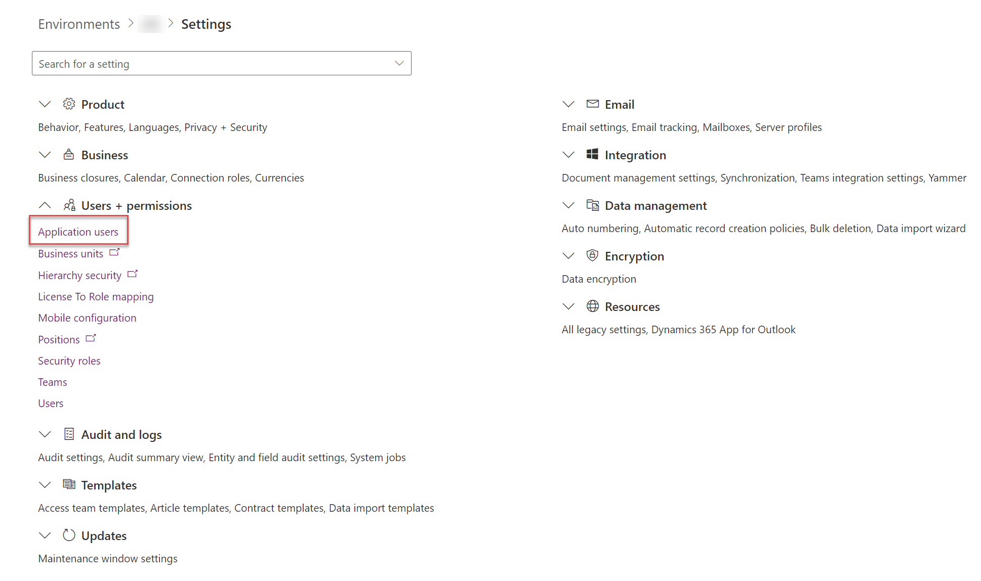
This is because we now have a new way of creating and managing these, which is now available via the Power Platform Admin Center. This article goes into further details, with the changes described appearing to have been rolled out recently (on or around mid-February 2022). Rather strangely (or annoyingly, if you are glass half full kind of person), there doesn’t appear to have been much fanfare around the announcement, and it doesn’t even seem to get a mention as part of the 2022 release wave 1 plan. Notwithstanding this fact, I believe this is a change we can welcome. To start working with Application Users in the new way, we should navigate first into the Settings for our Dataverse environment, where we should now find ourselves greeted with a new option under the Users + Permissions area:

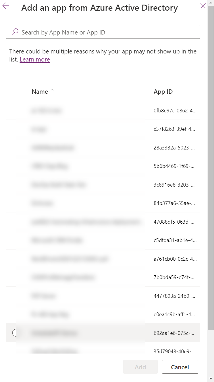
I like this new experience because it simplifies the whole effort involved. Instead of having to log down the Application (Client) ID, the Platform will automatically return a list of all applicable Application Registrations you have access to on the Azure side:

I suspect this does mean that if you don’t have access to the Application Registration, it will now be impossible for you to add this in yourself. So you may need to work with your AD Administrator to ensure that they complete these steps for you.
Updates that gradually wean ourselves off our dependency on the classic interface can only be embraced welcomingly. However, it is pretty frustrating that changes like this seem to be utterly non-relevant from an announcement standpoint. Yet, a change pertaining to a colour change on a seemingly random Dataverse component is put forward for all and sundry to digest. And by this, I don’t mean to trivialise the importance this UI change has from an accessibility standpoint; it’s just confusing that a change like the one being discussed in this very blog post seems to be completely unworthy of mention. But anyway, enough griping - if you weren’t aware before, now hopefully you are, and you can save yourselves 10-15 minutes of confusion wondering what has gone on. 🙂
